With the Hover Card widget from The Plus Addons for Elementor, you can easily trigger a hover effect by adding a parent container class name. By assigning a specific class to the element, you can add custom styling and animations for the hover state, creating a visually appealing effect that enhances user interactivity.
To check the complete feature overview documentation of The Plus Addons for Elementor Hover Card widget, click here.
Requirement – This widget is a part of The Plus Addons for Elementor, make sure its installed & activated to enjoy all its powers.
You can find the Custom Hover option in Background Style as well as in Text and Image content type separately, but the process works similarly for all.
Here we’ll use the Custom Hover option from Background Style.
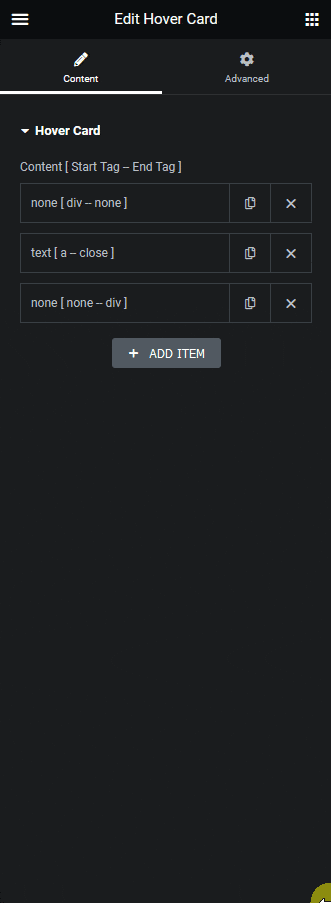
For example, we have an anchor tag button inside a container class called “card”.
Now we want to add a scale effect to the button when someone hovers over the “card” container.
So in the Hover Card widget, we have an item with Div as the Open Tag and card as the class name, since we want to add an anchor tag inside the div, we’ll set None as the Close Tag. We’ll select None in the Content because this div is just a container.
Then, in the second item, we’ll select a as the Open Tag and Default as the Close Tag. In the Content, we’ll select Text and add text for the button.
In the third item, we’ll set None as the Open Tag and Div as the Close Tag since we want to close the card container here.
Set None in the Content dropdown as well.
Note: Make sure to style the elements from the Style and Background Style section according to your need.
Now open the second item and turn on the Background toggle under the Background Style section.
Go to the Hover tab and turn on the Custom Hover toggle. In the Enter Class field, add the parent container class name you want to target, for instance, we’ll add “.card” here.
Note: Make sure to add the class name with .(dot) in front.
Now to add the scale effect, go to the Transform css field and add the transform CSS. For instance, we’ll add scale(1.1).
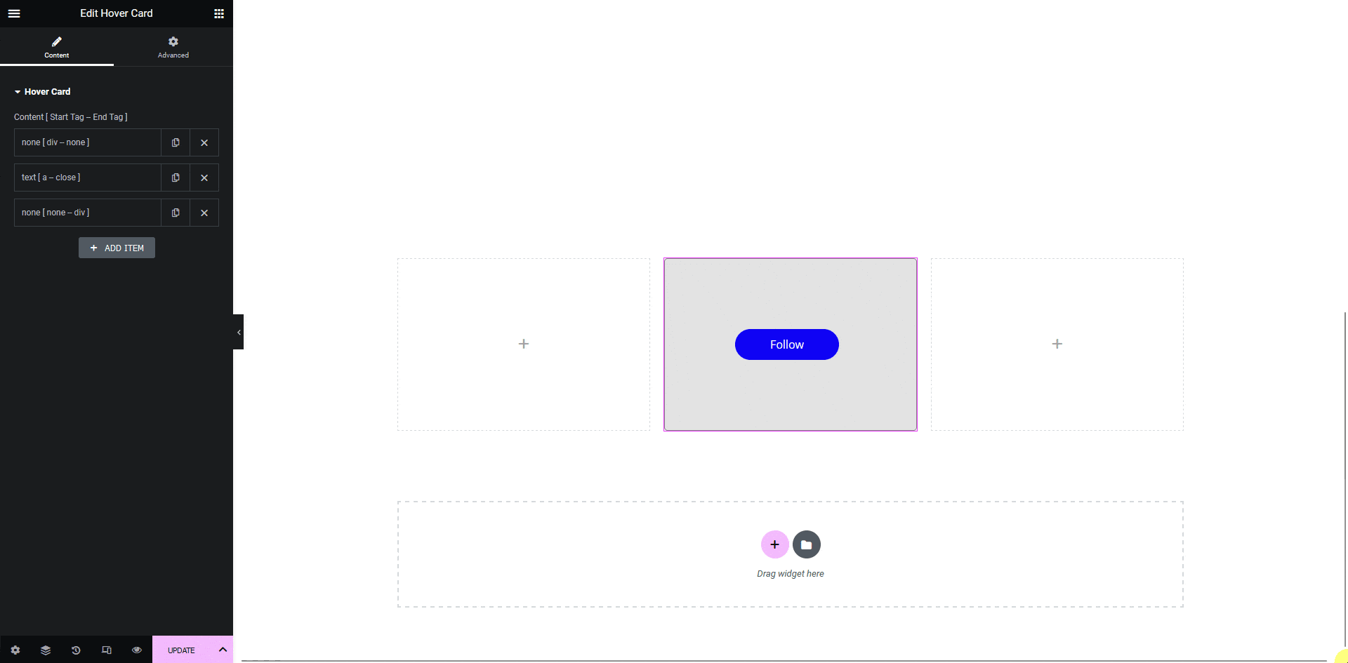
Now if you hover over the card container, the button will grow.
Also, read How to Create a Custom Layout With the Hover Card in Elementor.