Enhance the visual appeal of your Elementor website with the Hover Card widget from The Plus Addons for Elementor. This powerful widget empowers you to create stunning and interactive custom content layouts. Showcase your content in a unique and engaging way, capturing the attention of your visitors and delivering a great user experience.
Required Setup
- Elementor FREE Plugin installed & activated.
- You need to have The Plus Addons for Elementor plugin installed and activated.
- Make sure the Hover Card widget is activated, to verify this visit Plus Settings → and Search for Hover Card and activate.
Learn via Video Tutorial:
How to activate the Hover Card Widget?
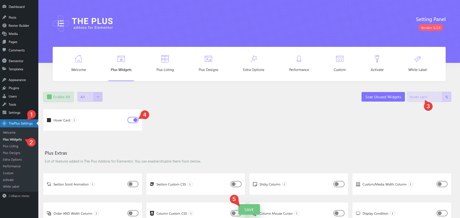
Go to
- The Plus Settings → Plus widgets
- Search the widget name and turn on the toggle then click Save.
Key features
Custom Content Layout – You can easily create a custom content layout.
Different Content Type – You can use different types of content like text, image, HTML, CSS and js.
How to Use the Hover Card Widget?
To use the Hover Card widget from The Plus Addons for Elementor, add the widget on the page.
Note: This widget is for developers only, it requires a good understanding of HTML and CSS to make custom layouts.
Note: Because this widget has so many customisation options, it can load a bit slowly at first (*only in the Elementor editor). Once loaded, it will work smoothly like any other widget.
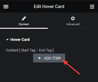
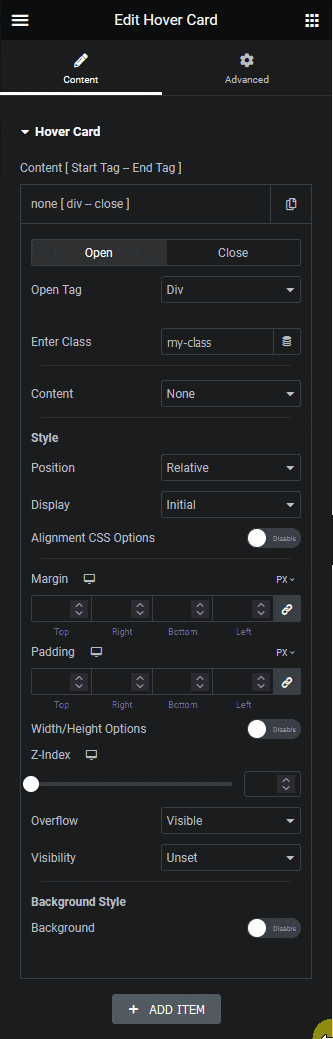
This is a repeater type widget, so you have to add an element first. To do so, click on the +ADD ITEM button.
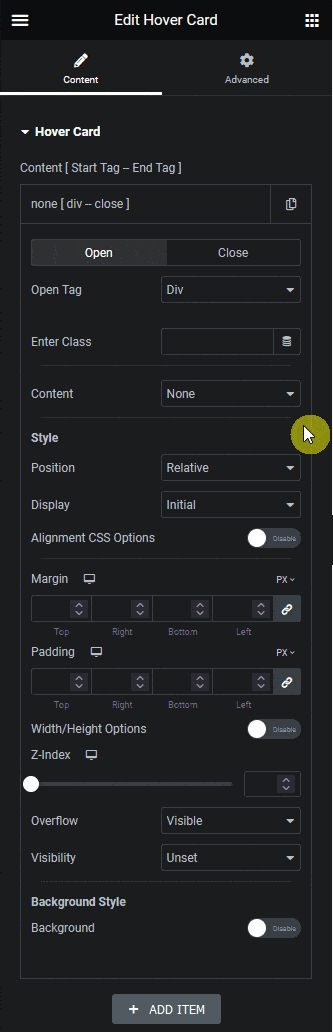
Open and Close Tab
It will open an item, from the Open Tag dropdown, under the Open tab, you have to select the opening tag. Here you’ll find multiple tag options –
Div – This is to open a div tag.
Span – This is to open a span tag.
H1 – This is to open a h1 tag.
H2 – This is to open a h2 tag.
H3 – This is to open a h3 tag.
H4 – This is to open a h4 tag.
H5 – This is to open a h5 tag.
H6 – This is to open a h6 tag.
p – This is to open a p tag.
a – This is to open an a tag.
None – This option won’t open any tag. You can use this option to add HTML, Style or Script content where no tag is required. If a tag is not closed within the item with this option, you can continue the tag across multiple items. Learn the process.
For the a tag only, you’ll get a Link field where you can add a URL for the a tag.
In the Enter Class field, you can add a CSS class name for a tag (except for the None option). This class can be used to target the element for styling.
Note: Make sure to add the class name without .(dot) in front.
From the Close Tag dropdown under the Close tab, you have to select the closing tag.
Default – This will auto close the tag opened in the Open tab.
For Div, Span, H1, H2, H3, H4, H5, H6, p and a options it will close the respective tags.
None – This option will not close the tag opened in the Open tab. This can allow you to add multiple elements inside one element.
Content
Then from the Content dropdown, you have to select the content type. Here you’ll find different content types –
None – With this option, no content will be added. This can be used to create an empty container that can have other containers in it without its own content.
Note: If Open Tag and Content both are set to None then you won’t see any options.
Text – With this option, you can add text content in the selected tag.
Image – With this option, you can add image content in the selected tag.
HTML – With this option, you can add HTML content with a WYSIWYG editor in the selected tag.
Style – With this option, you can add custom CSS to your layout. Ideally, None should be selected as the opening and closing tag.
Script – With this option, you can add custom js to your layout. Ideally, None should be selected as the opening and closing tag.
With each content type (except None) you’ll get relevant options.
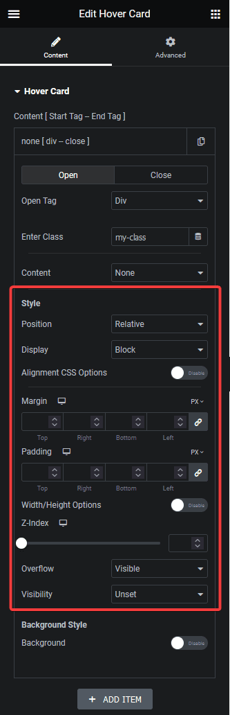
Style
From the Style section, you can style your element. Here you’ll find different style related options –
Note: When the open tag is set as None, the style option will not be available.
Position – From here, you can set the position to Relative or Absolute.
Display – From here, you can set the display property to Block, Inline Block, Flex, Inline Flex, Initial and Inherit for the element.
Flex Direction – For Flex and Inline Flex display property, you’ll get this option. From here you can set the flex direction property to column, column-reverse, row and unset.
Alignment CSS Options – From here, you can set the text alignment by turning on the toggle. For Flex and Inline Flex display property, you’ll get some flex alignment related options.
Note: The Text alignment option will depend on the display property set in the Display dropdown.
Margin – From here, you can add margin to the element for different devices.
Padding – From here, you can add padding to the element for different devices.
Top (Auto / PX) – You’ll see this option when the position is set to Absolute. From here, you can set the top offset.
Bottom (Auto / PX) – You’ll see this option when the position is set to Absolute. From here, you can set the bottom offset.
Left (Auto / PX) – You’ll see this option when the position is set to Absolute. From here, you can set the left offset.
Right (Auto / PX) – You’ll see this option when the position is set to Absolute. From here, you can set the right offset.
Width/Height Options – From here, you can set the width and hight of the element.
Z-Index – From here, you can set the z-index value of the element for different devices.
Overflow – From here, you can set the overflow property of the element.
Visibility – From here, you can set the visibility property of the element.
Background Style
From the Background Style section, you can set the background style of the element for both normal and hover state.
Note: When the open tag is set as None, the background style option will not be available.
Once you turn on the Background toggle, you’ll see a Normal and Hover tab here you can set different background related styling options.
Normal tab –
Background Type – From here, you can set the background.
Border Type – From here, you can set the border.
Border Radius – From here, you can set the border radius of the element for different devices.
Box Shadow – From here, you can set the box shadow.
Transition css – Here you can manually add CSS transition value to the element.
Transform css – Here you can manually add CSS transform value to the element.
CSS Filters – From here you can add a CSS filter to the element.
Opacity – From here you can add opacity to the element.
Hover tab –
Custom Hover – Here, you can add a parent container class name of the element by turning on the toggle. On hovering that parent container, the CSS property set in the Hover tab of the current element will be applied. Learn the process.
Note: Make sure to add the class name with .(dot) in front.
The rest of the options are the same as in the Normal tab, the values you set here will apply on hover only.
Note: You’ll find the same set of CSS property options for normal hover and custom hover, but you can set different values for each option.
Depending on the content type selected in the Content dropdown, you’ll get some extra styling options for that specific content type.
Click on the +ADD ITEM button to add multiple elements.
Advanced options remain common for all our widget, you can explore all it options from here.